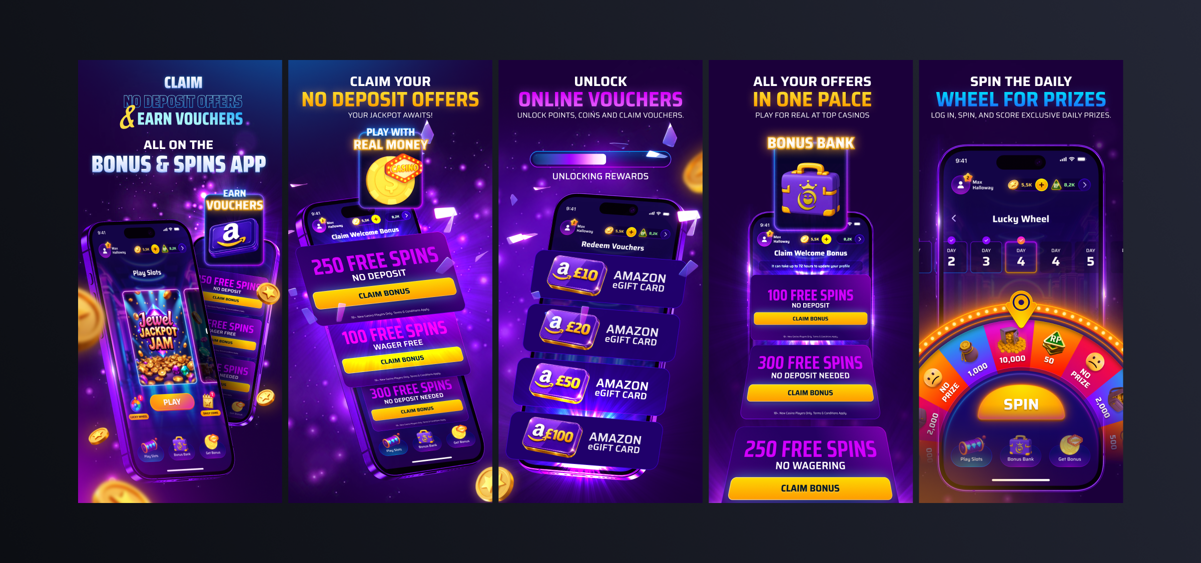
Bonus & Spins is a a first-of-its-kind iGaming affiliation app. Users can browse casino offers, register, deposit, and play via an embedded browser, all without leaving the app.
Every deposit earns Reward Points, redeemable for Amazon vouchers. The loop: claim a bonus, play, earn, redeem. Simple in theory. The product just needed a way to keep users inside it long enough to feel that loop close.
01 - THE PROBLEM
A One Way Door
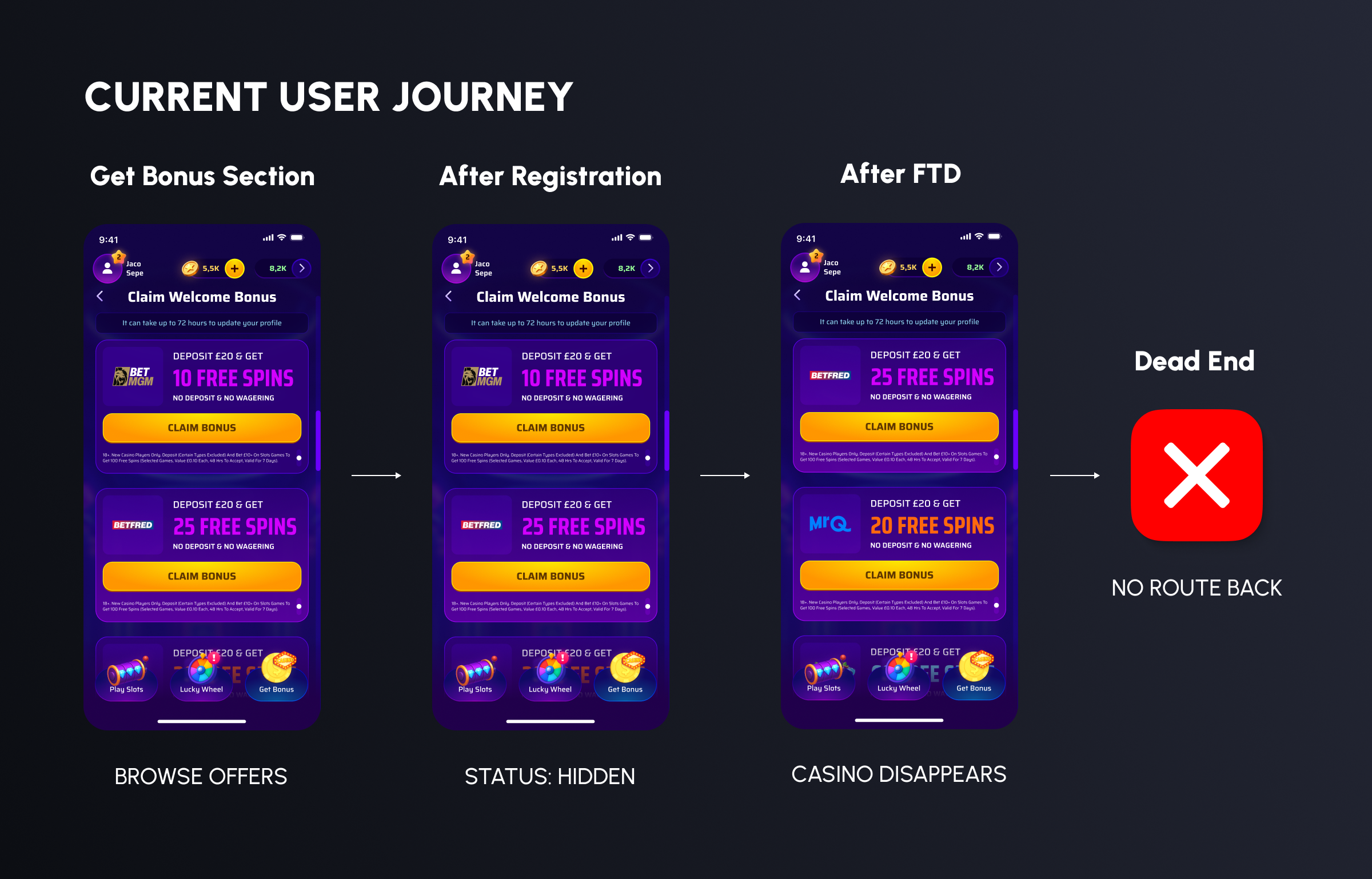
In the iGaming affiliate world, two things matter: registration, and first-time deposit (FTD). Registration gets a user through the door. FTD is the conversion event, the moment the casino pays the affiliate. From a business perspective, these are completely different milestones. From inside the original Bonus & Spins app, you couldn't tell them apart.
Whether a user had just registered or already deposited, their casino card looked identical. No status, no progress, no sense of where they were in the journey. The distinction that mattered most was completely invisible.
Then, once a user made an FTD, the casino disappeared from the list entirely. The product was built around a transaction it then made users forget.
02 - RESEARCH & TESTING
What the data told us
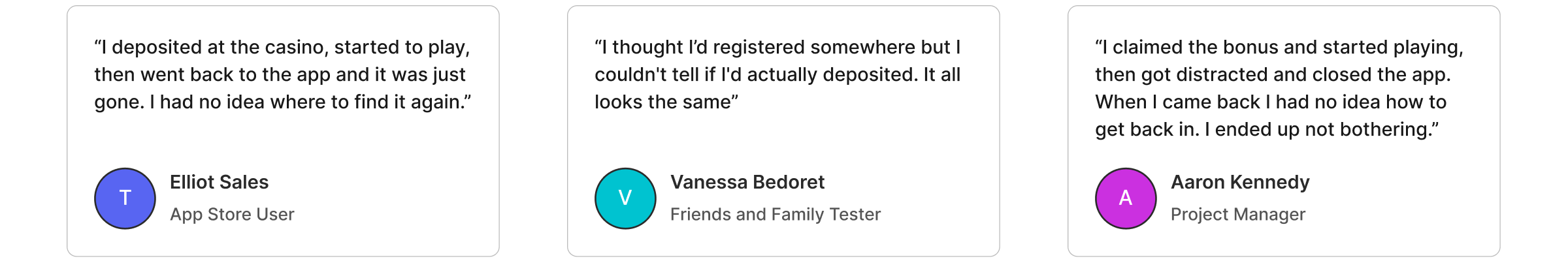
We ran user testing to understand why session depth was low and return rates weren't where we wanted them. The findings were consistent.
01
Users had no visibility into their own funnel status. The registration-to-FTD progression, the entire point of the affiliate loop, was happening behind the scenes, with nothing in the frontend UI to reflect it.
02
Several users returned to "Get Bonus" looking for a casino they had already deposited at, but the app had already removed their casino from the list. The mental model and product structure were out of sync.
03
After claiming a bonus, most users dropped off quickly. Not from disengagement, but from a lack of direction. The app completed the transaction and left them with an empty screen.
04
When asked, users described the disappearing casino as the app "forgetting" what they had done. That's not neutral, it actively erodes trust in the product.
03 - PERSONAS
Who we were designing for
Marcus, 32 THE BONUS HUNTER
Motivated by value. Wants to maximise bonuses claimed and points earned. Engages consistently, BUT only if there's always something to act on. Needs clear progress toward his next reward and visibility of everything he's claimed.
Sophie, 27 THE CASUAL PLAYER
Here for a quick, enjoyable session, not the deal. Found a few casinos she liked and wants to come back to them. Needs one frictionless place to go, with her casinos ready and waiting.
James, 41 THE STRATEGIC DEPOSITOR
Reads the T&Cs. Picks casinos methodically, tracks what he's deposited where. Needs a clear view of what he's registered for, what he's deposited at, and what's still waiting to be claimed.
04 - DESIGN STRATEGY
Solving retention without breaking the business model
The problem had two layers. On the surface: users couldn't get back to casinos they had deposited at. Underneath: the app had no way of showing users where they were in the affiliate journey. Two completely different states, identical UI. The solution needed to address both, but without disrupting the "Get Bonus" flow that was already working.
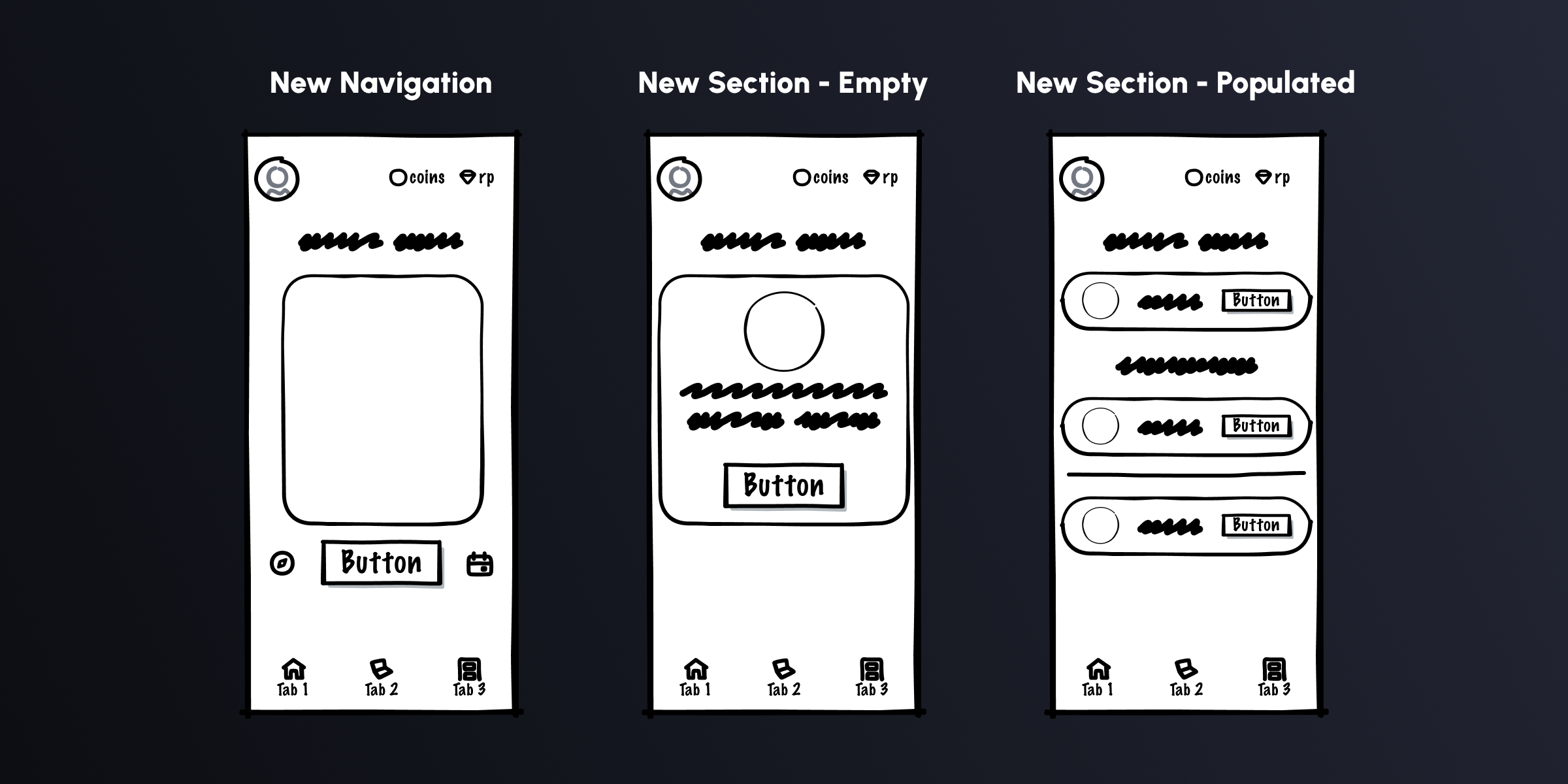
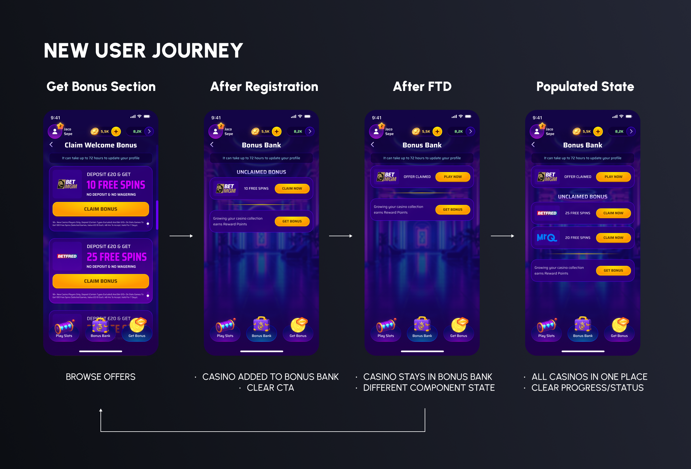
01. Keep "Get Bonus" focused. New offers, new casinos, forward momentum. No mixing of states, no clutter.
02. Create a persistent destination. Claimed casinos need a home, somewhere the user can find them, return to them, and play from directly.
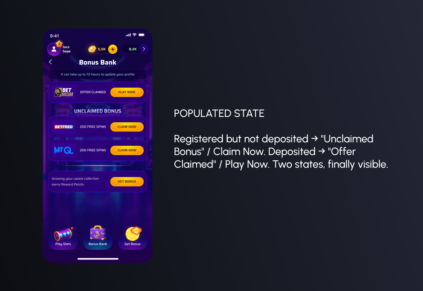
03. Make the funnel stages legible. Registered but not deposited? Clear label, clear action. Deposited? Reflected in the UI, with a direct route back to play.
05 - THE SOLUTION
Introducing the Bonus Bank
The problem had two layers. On the surface: users couldn't get back to casinos they had deposited at. Underneath: the app had no way of showing users where they were in the affiliate journey. Two completely different states, identical UI. The solution needed to address both, but without disrupting the "Get Bonus" flow that was already working.
06 - NAVIGATION DECISIONS
Earning a spot in the nav
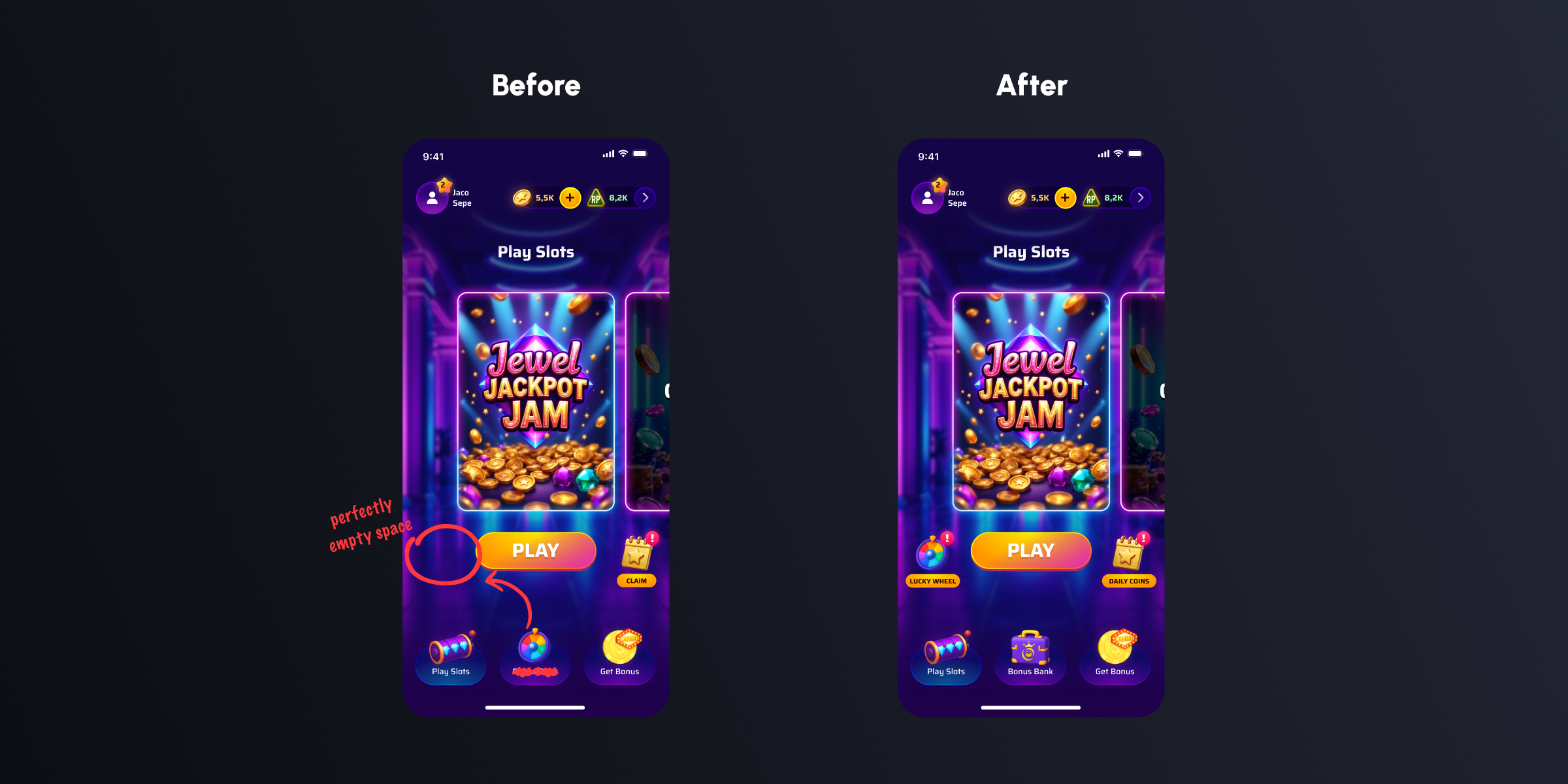
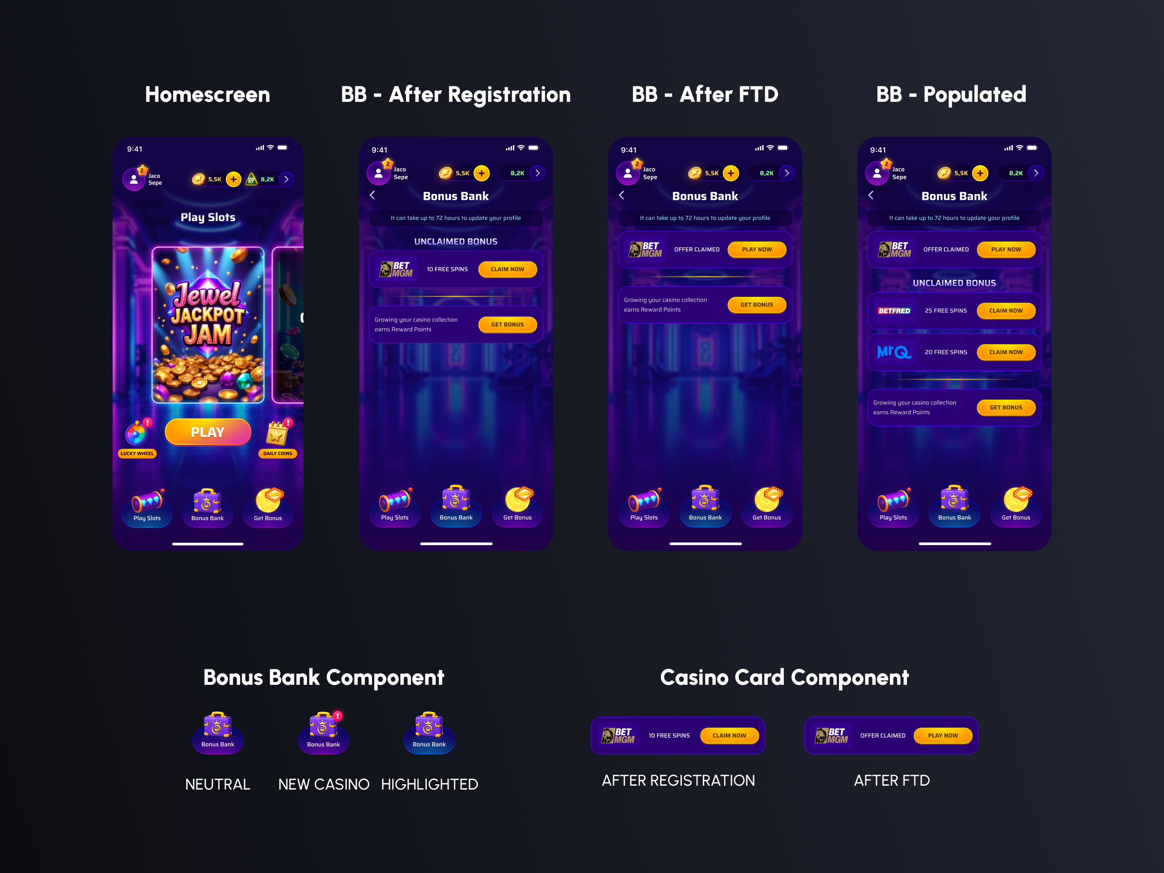
Adding the Bonus Bank meant making a call about where it lived. The existing centre slot in the bottom navigation was occupied by the Lucky Wheel, a daily login bonus. Useful, but not a destination. It didn't warrant permanent primary nav real estate.
Lucky Wheel moved to the homescreen alongside the Play button as a secondary quick-action, joined by Daily Coins in the same position. Two lightweight daily touches, accessible without competing for the navigation's three slots. Bonus Bank took the centre.
07 - FINAL DESIGN
Key Screens
08 - OUTCOMES
What changed
2-3x
Avg. casinos deposited per user (up from one)
+25%
Return session rate - Users coming back to play existing casinos
+200%
FTD completion - Unclaimed Bonus section as persistent nudge
The Bonus Bank gave users a reason to come back, and a place to come back to. Before, the product peaked at the first deposit. After, that moment became a starting point: a growing collection of casinos, offers, and sessions. The multi-casino journey felt natural rather than effortful, because users finally had somewhere to manage all of it from one screen.